7 Tips for Designing an Attractive Restaurant Website
Restaurant owners have a lot on their plate, and having an attractive, easy-to-use website may seem like the last of their concerns. However, as more diners are turning online to research restaurants, there is no time better than now to build a good-looking website designed to attract more customers and entice them to walk into your restaurant.
For someone who has never built or designed a website before, doing so can be intimidating. With the help of the following design tips and perhaps a pair of tech-savvy helping hands, you can learn to design a restaurant website that draws attention and drives food traffic to your business.
Keep it simple.
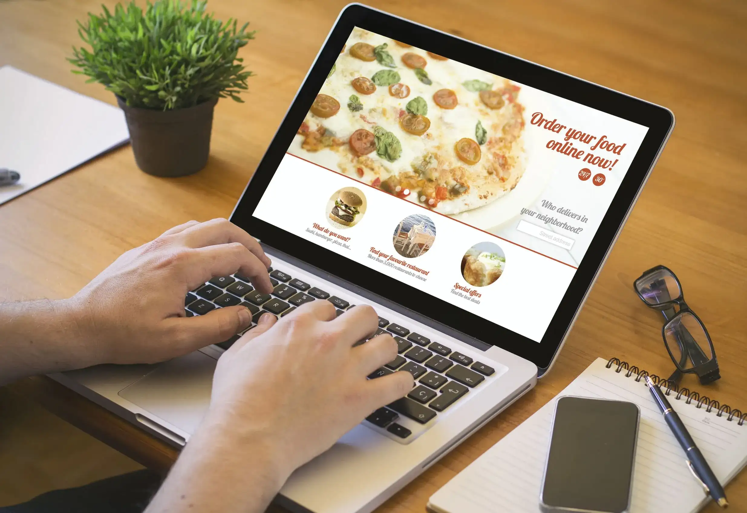 There are four things that most customers are looking for on your website:
- Location
- Hours of operation
- A contact number for making reservations
- Menu
Make sure all four items are prominently featured and labeled on the website. Use a map service such as Google Maps to embed on your homepage to help people find you easier. Customers don’t want to work hard to look for any of these details, so place them in a location where they will not be missed, such as in the top header.
The menu isn’t always expected on the front page, but you want to include a prominent link that leads to it. If you have several menus, such as a separate kid’s menu or vegetarian menu, make sure they are clearly labeled. Protip: Do not simply take a picture of your existing menu and upload it as a PDF on your website. Create a page that is dedicated solely for the menu so people can read it without having to download anything on their devices.
Choose the right color palette.
Color psychology, or the study of how colors affect people, has shown that colors elicit certain bodily and emotional reactions. For instance, red and orange are bright, stimulating colors that can increase the heart rate and whet the appetite. You see fast-food restaurants making full use of reds and oranges in their marketing materials, packaging, and interior design. On the opposite side of the color wheel are the more calming colors of blue and green. These colors slow the heart rate down and can suppress appetites. Intelligent use of these soothing colors can help customers relax and feel better with your brand.
Use this to your advantage when designing your website by choosing colors that can evoke certain emotions and are more likely to lead people to certain actions. However, don’t go crazy with the reds and oranges. Designing a website means designing for a screen, and too much of these vivid colors can cause eye strain for your customers. Only use these striking colors for the most important spots on your website, such as the Order Now button or the header that contains the menu. Keep the background a neutral shade, such as a cream, ivory, or light gray, to minimize discomfort for your customers.
Don’t use anything that compromises performance.
 Internet users are very impatient. Research shows that many of them will not even wait for 3 seconds for a website to load before they abandon it. Having a website that loads at lightning-speed is crucial if you don’t want people leaving before they see anything. This means resisting the urge to add Flash, music, or other resource-intensive elements that you don’t really need and can significantly affect how fast your website loads.
Most people who are new to web design assume that using Flash makes their website look better. On the contrary, Flash is extremely outdated and is set to be fully retired in 2020. Music on your website is also a no-no. It just annoys customers because they have to do more work looking for the button to turn it off if there is one.
Highlight the reasons for customers to come back.
Most restaurants will have their basic information displayed prominently on their websites for customers who visit once. However, you want visitors to keep coming back to your website by sharing specials, promos, discounts, and one-time events.
If you have specials or coupons that change regularly, create a dedicated page for that and update it as needed. If you’re using a content management system such as WordPress, it is easy to update the information on your website without needing the services of a professional.
Make your website easy to navigate.
 When customers land on a high-quality restaurant website, they should be able to find what they are looking for intuitively. Having a strong navigation menu makes it easy for customers to make their way around. It also tells search engines such as Google and Yahoo how their spider bots crawl through your website.
It starts with the main navigation menu that stands out from the rest of the website and easily draws in the customer’s eyes. This is typically found at the top left, right, or center of the page. Responsive designs, or designs that adapt to the size of the screen the customer is using, typically have a hamburger menu. This is a more compact style composed of three horizontal lines.
You may also want to add large buttons for your calls-to-action, such as Call Now or Order Now, placed at the top of the menu.
Create great content.
The old saying “Content is king” is true. The more content you have, the more you can impress the search engines. And the higher-quality content you have, the better you can attract human customers.
Examples of content that restaurants can include on their websites are social proof content, such as testimonials from happy customers and positive reviews on social media. If you have reaped any awards in the past, you can also include those.
You can also build a blog and write regularly. Maintaining a blog is no easy feat, even for those who don’t work in the restaurant industry. However, if you can update your blog even at least once a month, you will be able to stay on top of your customers’ mind by providing them with fresh, relevant content. You can also offer exclusive coupons and discounts in exchange for subscribing to your blog updates.
Videos are also another great way to engage your customers with content. For instance, you can share short and sweet videos of chefs preparing your most popular dishes.
Optimize for search engines.
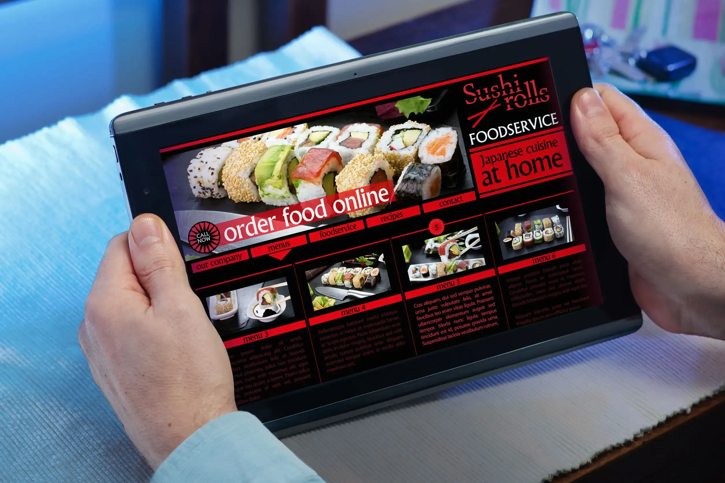 Design a website that both search engines and humans will love. While a lot of your visitors will come from restaurant review aggregator services such as Yelp, plenty of people are turning to Google to find restaurants in their area.
Learning how to do search engine optimization (SEO) properly requires a steep learning curve. If you decide to do it on your own, be wary of resources that advocate for black-hat SEO techniques, such as link farming or keyword stuffing. These are ineffective methods used to game the system that can get your website penalized and removed from the search rankings.
If you have never done any SEO before, it is best to enlist the services of a professional to save you a lot of time and keep you from engaging in black-hat SEO.

